The Yan Yan Carnival
Meiji Seika has given its Yan Yan snack packaging and mascot a makeover, with the Yan Yan boy being more contemporary and cuter to showcase the snack’s personality and increase its appeal among children and young adults.
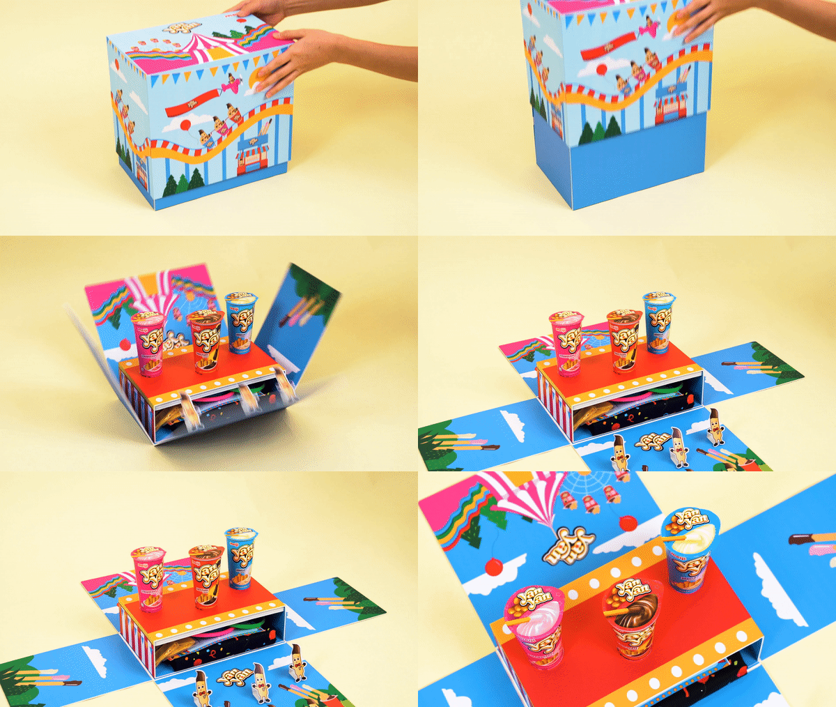
Along with the rebranding was a press kit for media outlets and key opinion leaders known as Yan Yan Carnival, which was inspired by the excitement of every child’s Yan Yan snack experience. According to the spokesperson, Meiji wanted to convey the message that every cup of Yan Yan opens up a whole lot of fun for young consumers and those who are young at heart.
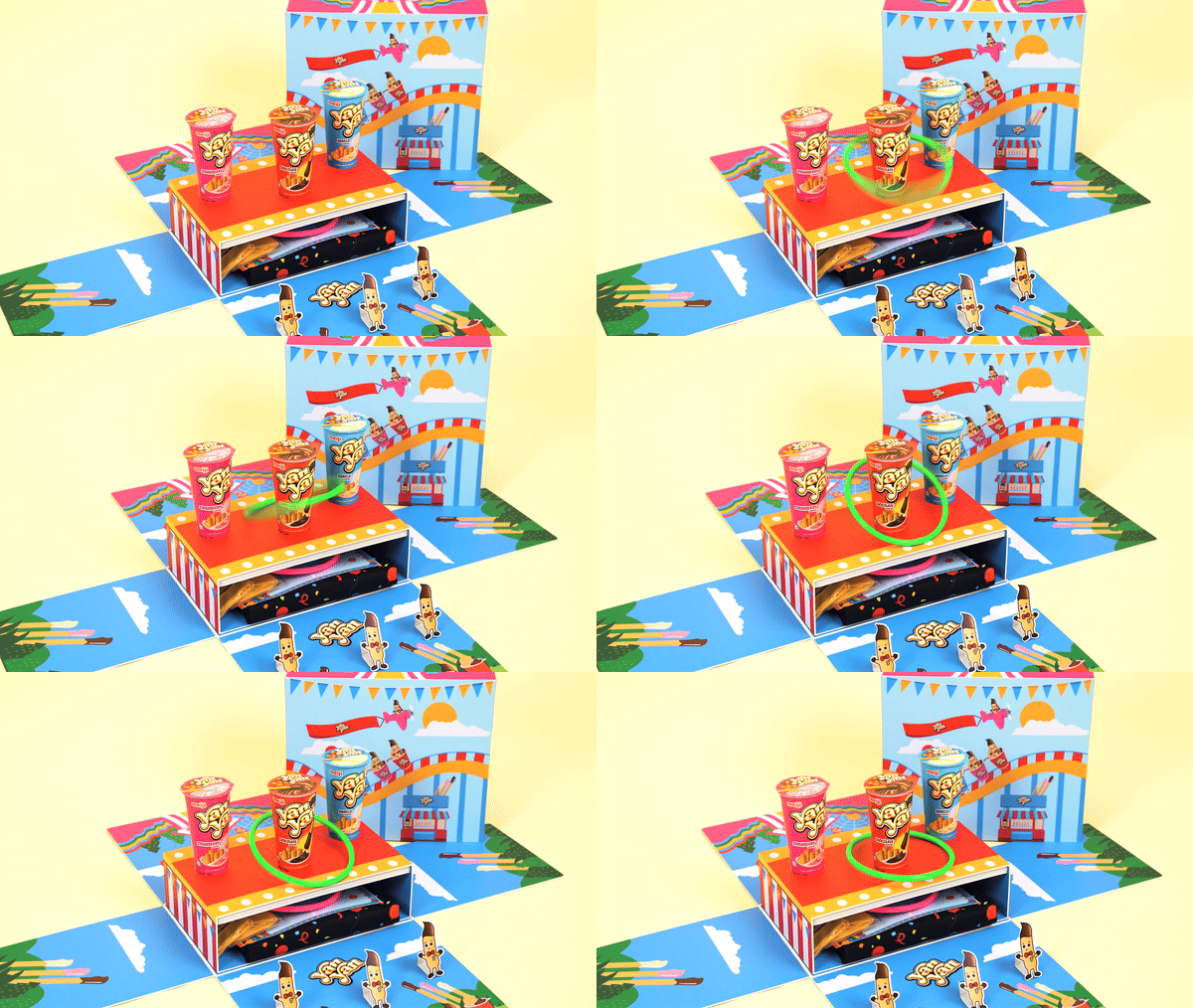
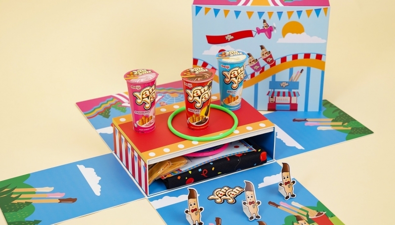
Along with the bolder and brighter look on the packaging, Meiji decided to parallel the feeling of fun and excitement with a colourful, lively carnival experience. This was encapsulated by a literal mini-carnival, opening up to an interactive game and glorious Yan Yan goodies – the Yan Yan cups, a carnival tee, exclusive Yan Yan clappers and the ring toss set-up.
Credits
Creative Agency: PROTOCOL Singapore
Client: MILO
Art Director: Luqman Daud
Art Director: Petrina Wee
Illustrator: Luqman Daud
Director: Nathaniel
Production House : Unmastered


